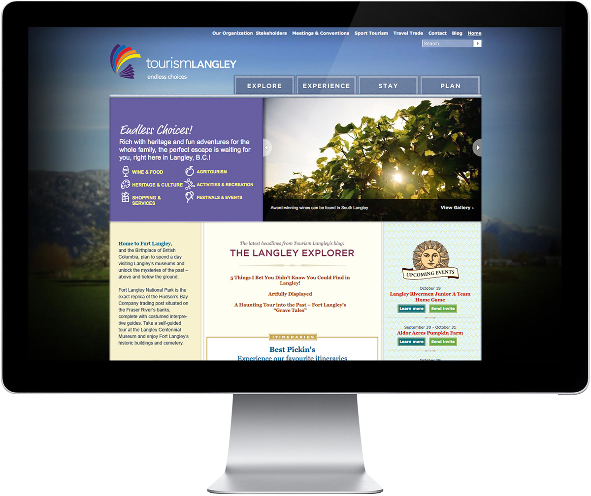
Tourism Langley’s homepage features country market-style treatments using illustration and texture to reflect Langley’s rural tone. Large image carousels and vast background landscapes help convey the diversity of settings to be found in Langley.
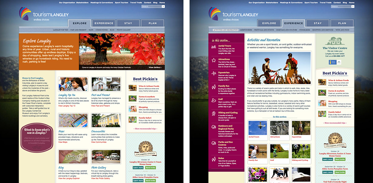
Supporting pages welcome potential visitors through the use of rich, vibrant blocks of colour and a wide variety of photographs. Additionally, illustrations, decorative badges, and friendly typefaces amplify Langley’s unique offering, and bring unity to the site.
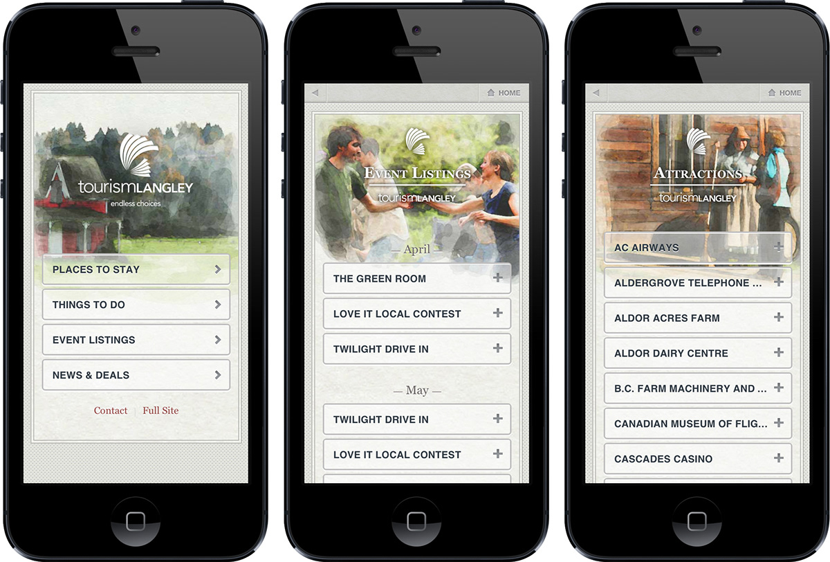
Tourism Langley’s mobile site acts as a distinct property, while taking cues from the core website. Customized watercolor treatments evoke a sense of craft, and reflect the natural characteristics of the destination. Meanwhile, simplified navigation makes it easy for users on the go to access relevant listings data.
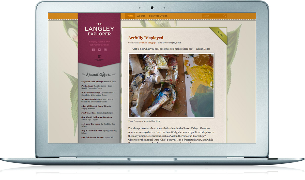
The Langley Explorer is a new blog that stands apart from their core website, while cross-pollenating with Tourism Langley’s other digital properties. We helped them shaped a name, editorial calendar, and content strategy, all aimed at encouraging community participation and engagement.
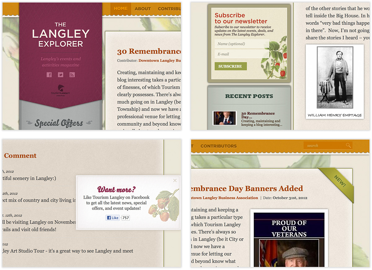
This blog also works to reflect the tone found in the other Tourism Langley properties. Material textures, agricultural illustrations, crafted typefaces, and ornamental borders all reflect the artisanal character, and history of Langley.
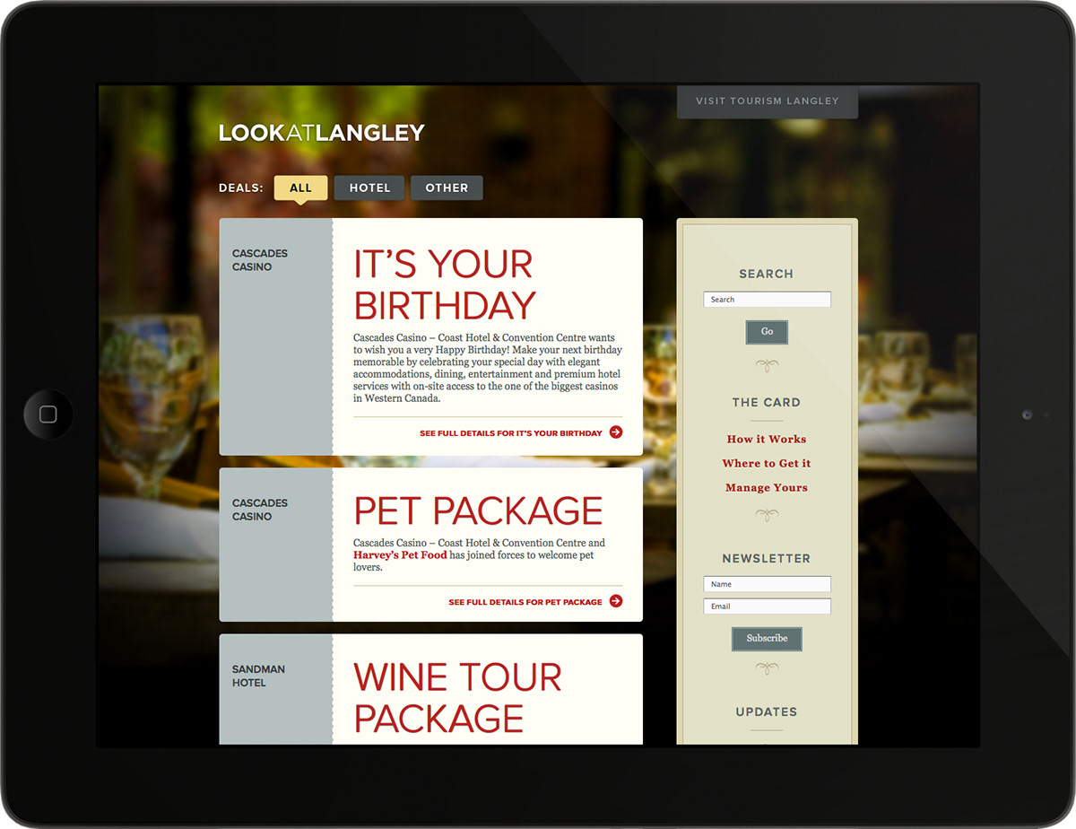
Look at Langley allows Tourism Langley to work together with local businesses and accommodations in the area. It affords them a means of showcasing deals and packages available to those visiting, and living in, Langley.
View full case study here.


